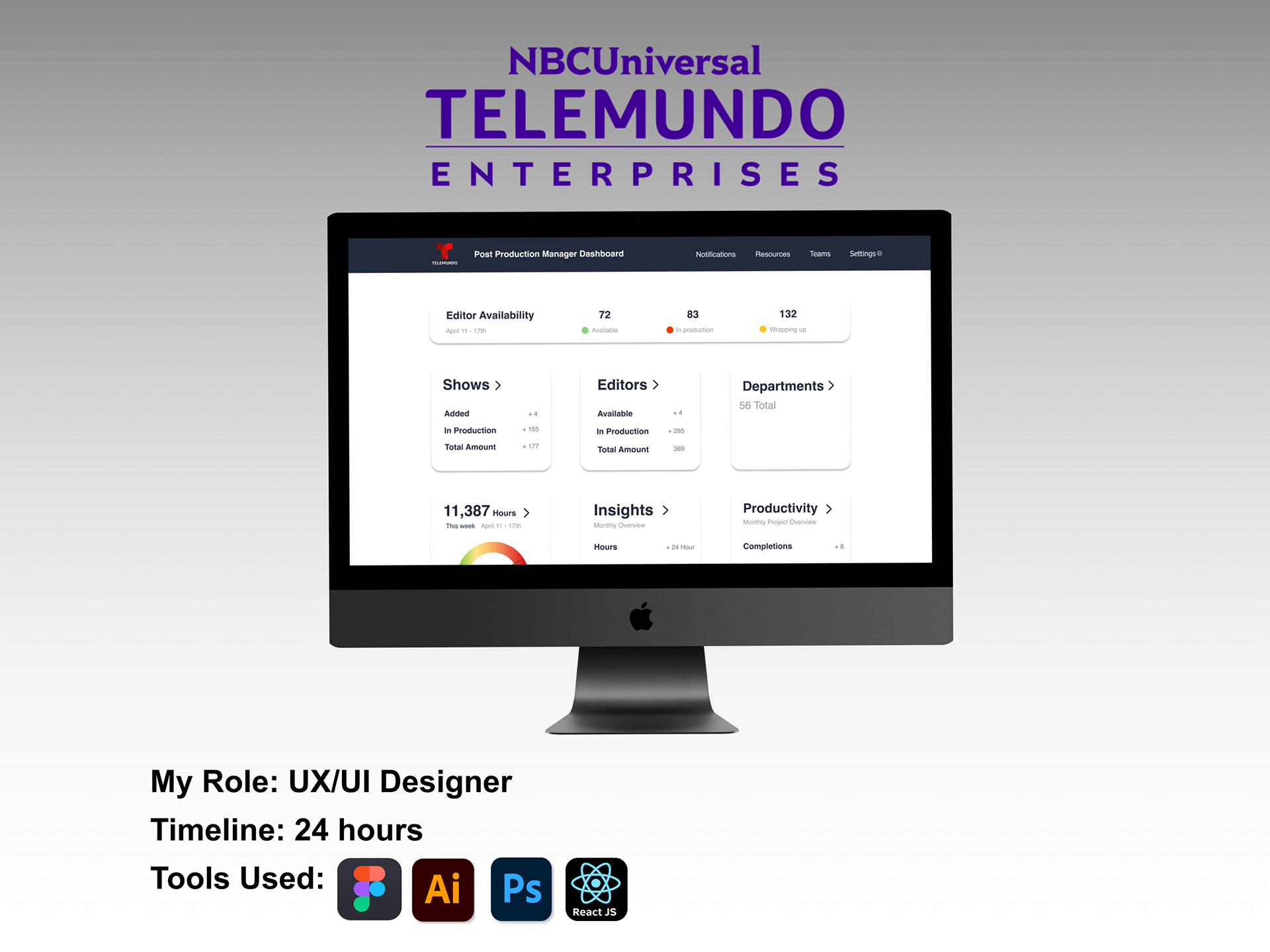
Design Challenge:
"How can we visualize our booking data to maximize the use of talent and shared resources of the Post-Production Center of Excellence?"
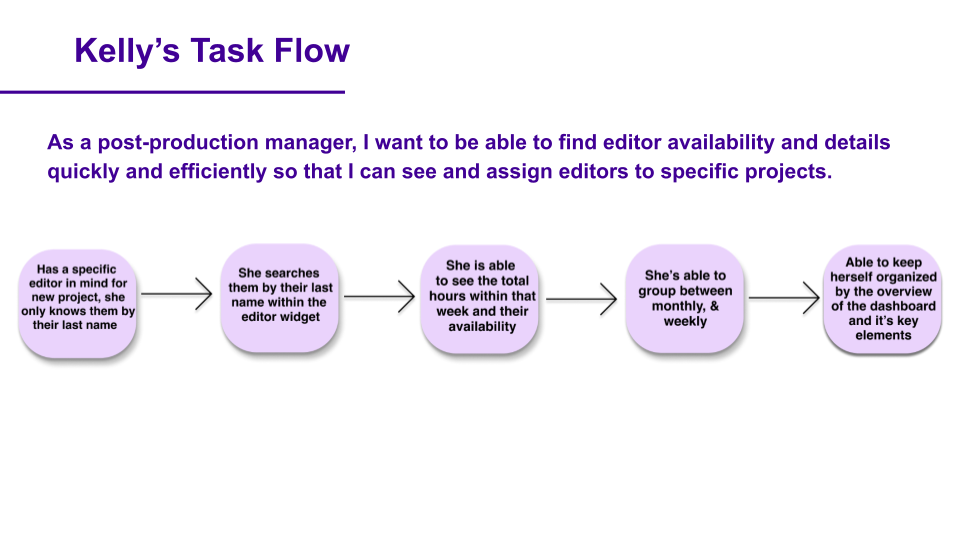
With a 24-hour time frame, my team and I were presented a design challenge to create a dashboard that will allow users within production management to be able to easily visualize different time frames of each editor.

The Problem:
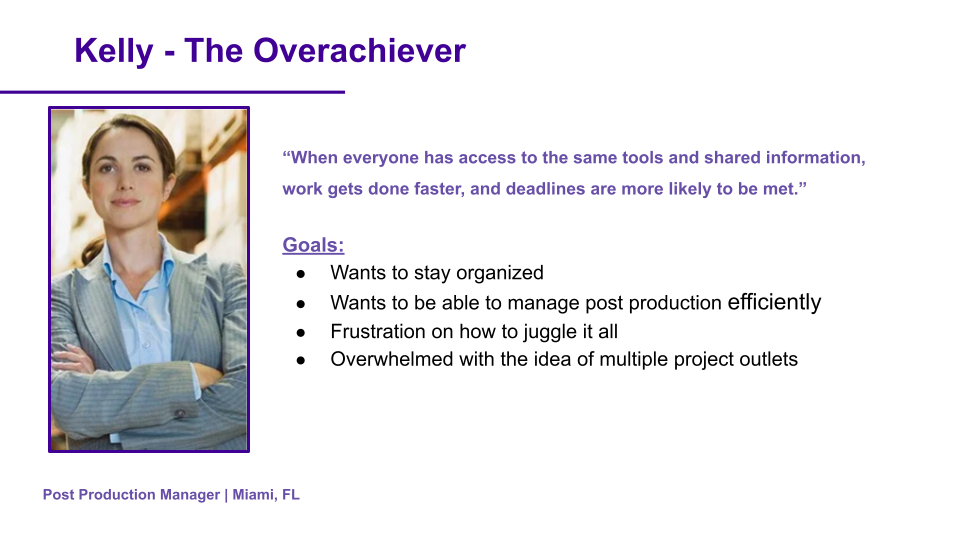
With a large number of editors and projects consistently happening, post-production manager’s have a hard time visualizing the team product space at scale in order to see who is working, what they are working on, who’s available and how many hours are being worked.
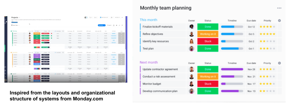
UI Inspiration:
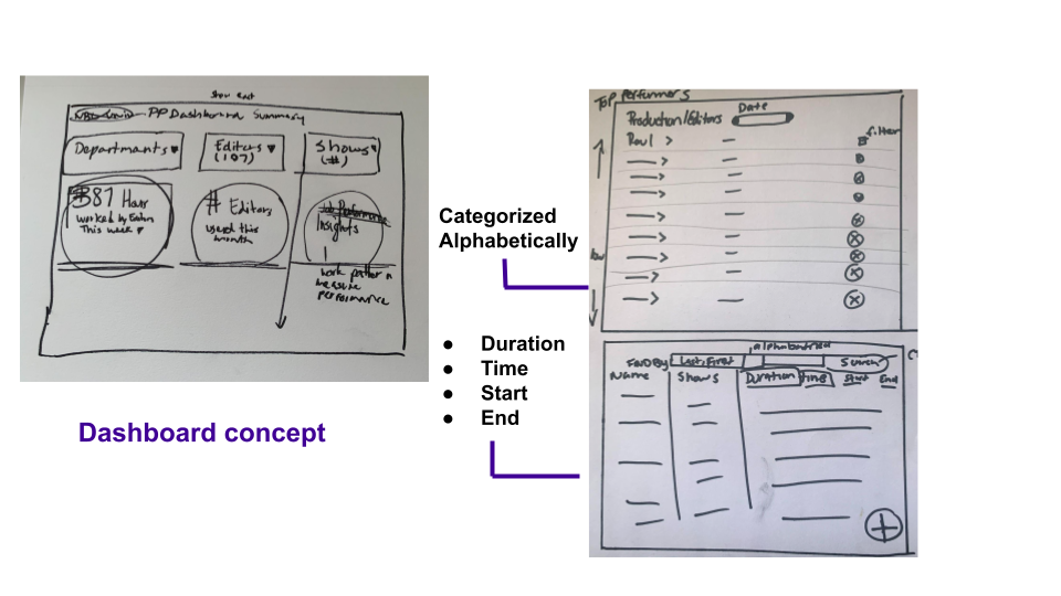
Sketches:
Lo-Fi Wireframes:
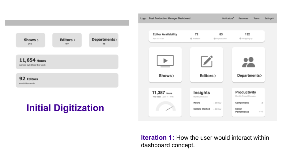
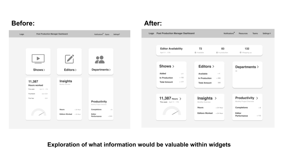
Wireframe Iterations:
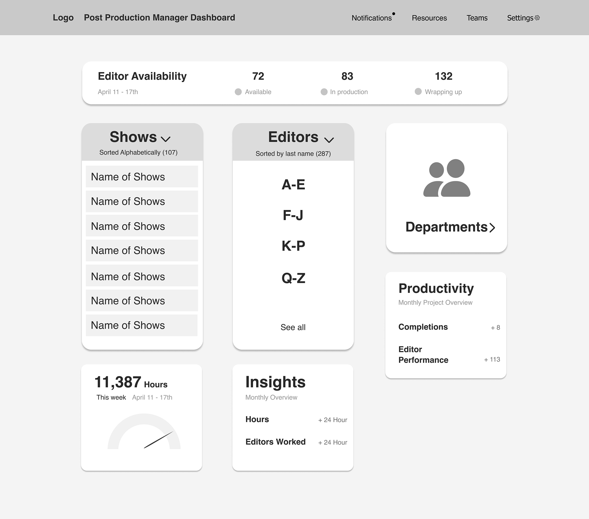
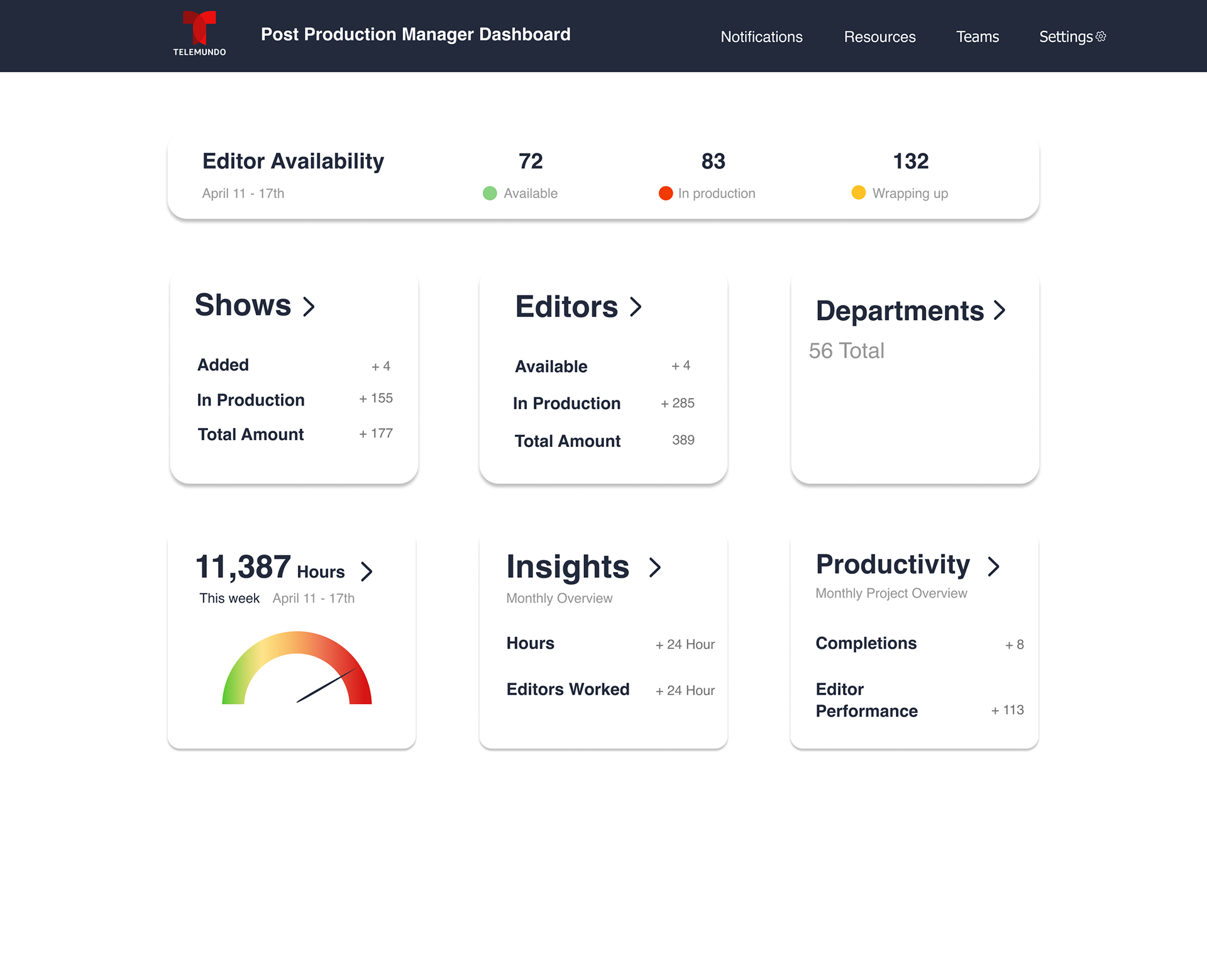
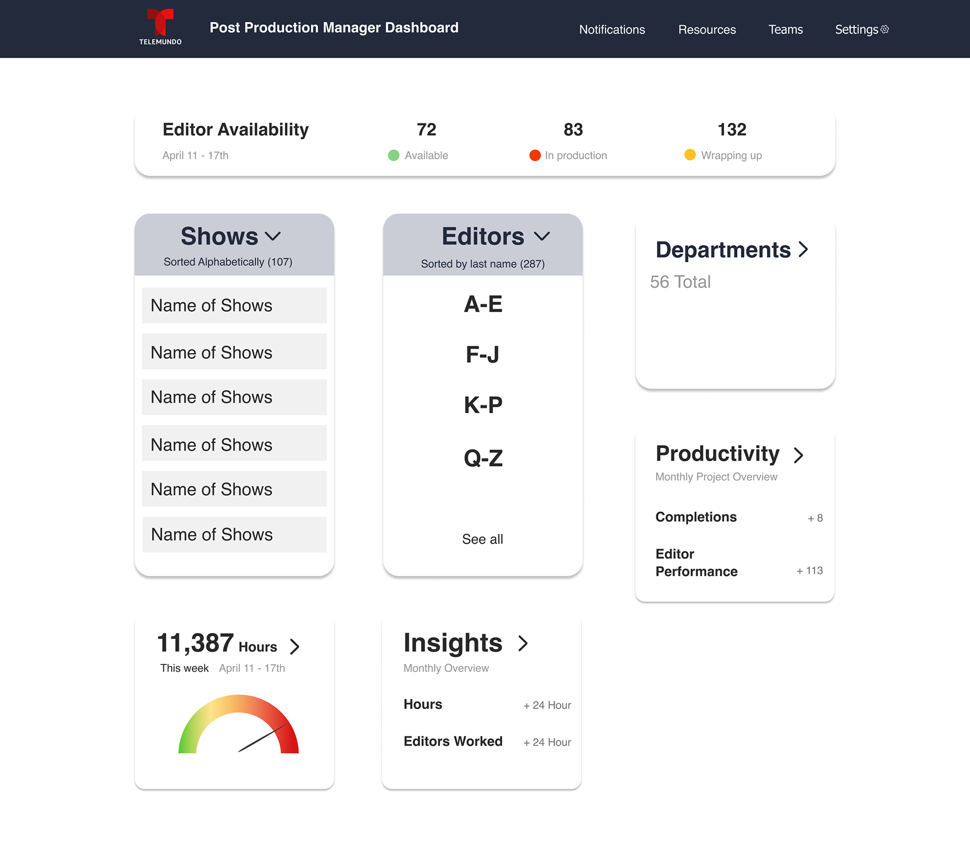
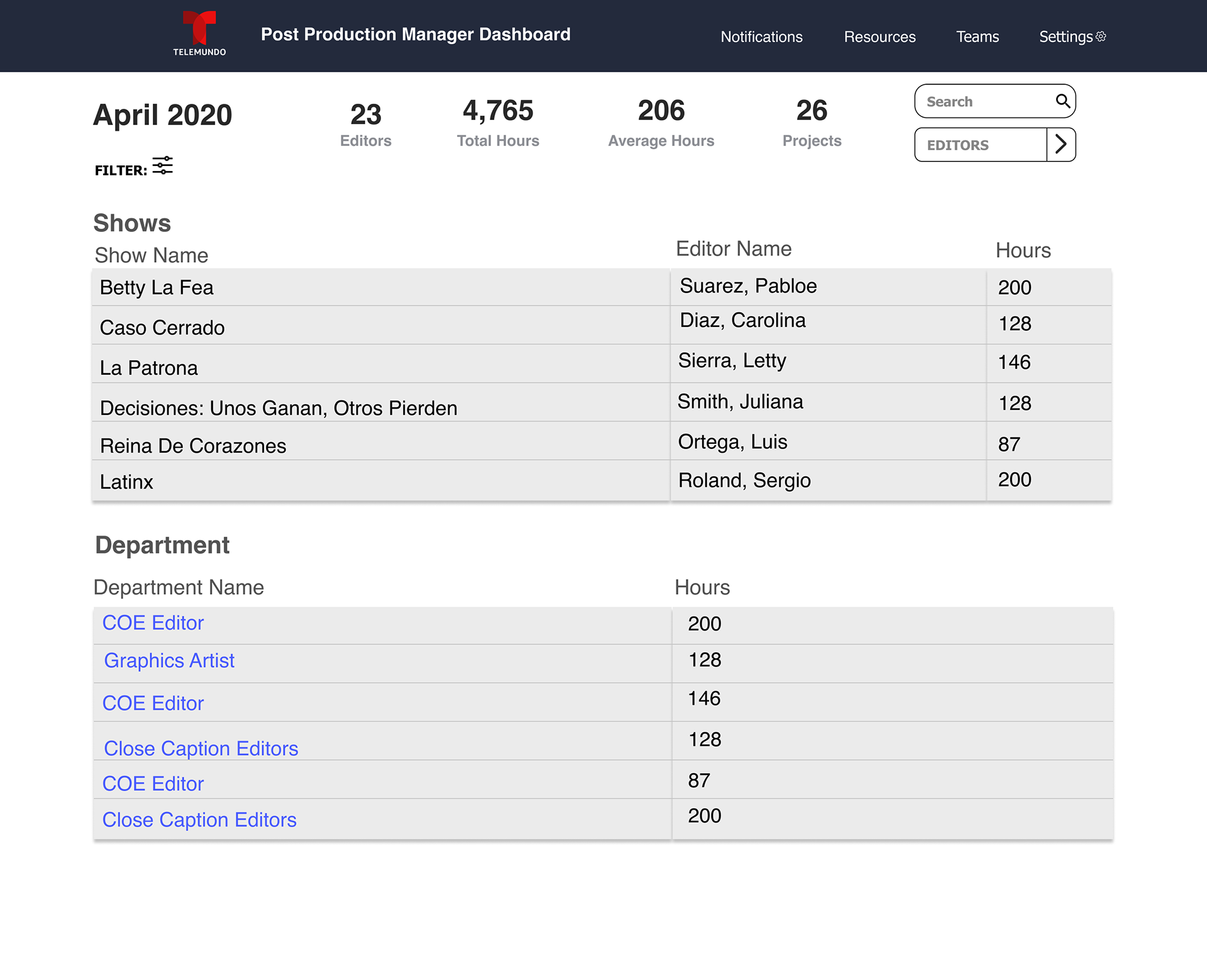
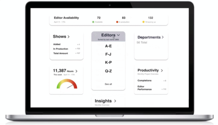
Hi-Fi Wireframes:
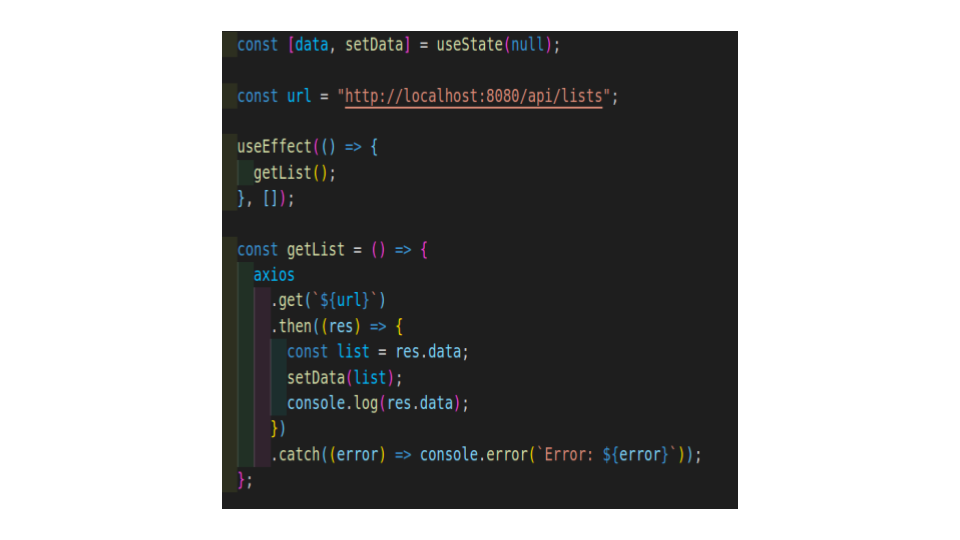
Front/Back End:
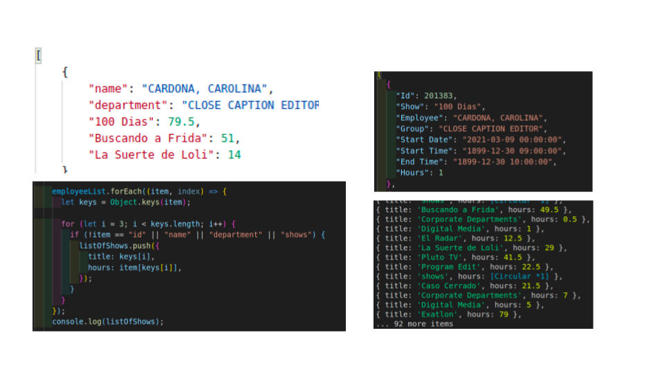
During the design and development process. Our web developers were able to work the back end of the name files of each editor and which show they were set to work during production time. With the data provided we will be able to categorize each editor accordingly to their department and task.
Back End Development
Front End Development

Prototype:
Next Steps:
- User Testing, complete the process of user testing within production management and the editors.
- Incorporate user testing feedback within dashboard revision.
- Incorporation of UI elements (such as notifications, widget expansion, and detailed within categories).
- Add additional color coordination for UI elements after completion of user testing feedback.